Creating a Digital Space for the Art Project
My Role : Web Designer
Timeline : 2017 / Still launched
Platform : Responsive Web Design
Methodology : User-Centered Design (UCD)

Workshop with Nowolipie Group organized within the frames of the project Children of Dust. Source: u-jazdowski.pl
My Key Contributions
information architecture | high-fidelity prototyping | accounting for accessibility | conducting usability tests | interface design
Tools: Sketch, Marvel, Google Workspace, Asana
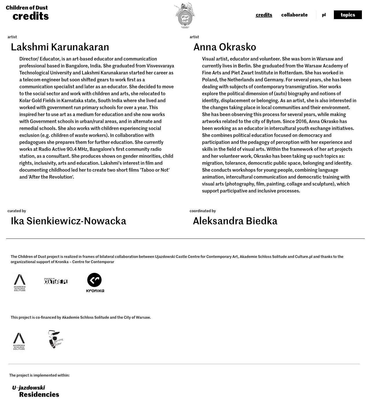
The Children of Dust - website project / Credits & special thanks goes to: Custom Typeface: Interpunkcja font designed by Marian Misiak, Tomek Bersz; Project logo designed by Anna Okrasko, Lakshmi Karunakaran; Client Service: Agata Kühl; Front-end developers: Daria Zychowicz, Roman Kühl; Art Direction & Final Web Design: Rubovka
Deepest thanks to the Rytm.digital, based in Warsaw (PL), for stunning collaboration throughout the creation of this website. I am honored and grateful for their trust in me to design and bring this project to life.
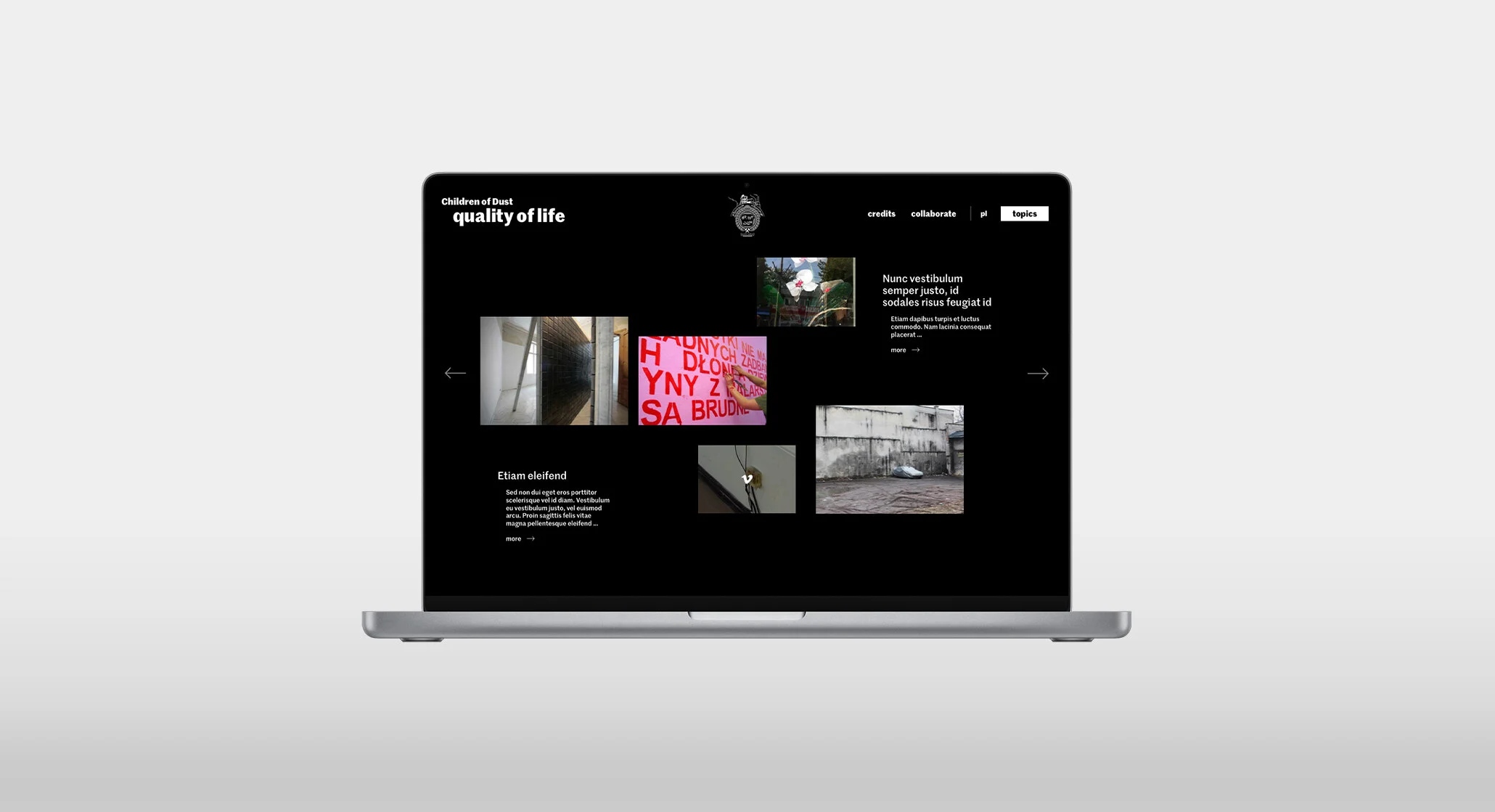
Documenting "Children of Dust" project, based on the new visual identification requirements.
The goal of the Children of Dust project is to capture the personal experiences and stories of children from Bytom, Poland, and Kolar Gold Fields, India. Through workshops and documentation, the project aims to shed light on the intertwining relationships between family narratives, industrial landscapes, and societal transformations in these post-industrial cities.
The website's primary goal is to offer users an engaging and educational experience. They can explore the personal stories and artworks created by the children, gaining insights into the impact of post-industrial landscapes on their lives.
The client's key goal was to provide a dynamic and immersive space where the project's documentation, including various forms of media such as photos, films, sounds, and texts, could be presented to and explored by visitors.

Empowering Voices, Inspiring Narratives
The client's visual identity directly impacted the way content was laid out in the final product. The visual identity was based on typography, specifically the chosen font, which was complemented by specially designed punctuation marks and a content organization system.
Additionally, a sense of freedom was introduced, allowing for the use of various graphic forms such as photos, illustrations, or photomontages.

User Research
The conducted interviews revealed that the main group of users are intellectuals who need a convenient way to explore content, but also revealed other factors affecting online documentation readership, such as navigation, the ability to focus on the media and content.
Goals → Users want to explore the content in a convenient way; to have an intuitive and easy-to-use navigation to access different sections and content within the web; aims to focus on the text and its content without distractions, ensuring a meaningful and informative reading experience.

Pain Points
Users may find it challenging to navigate through the online dcumentation if the navigation structure is unclear or confusing.
Users might get easily distracted by irrelevant or overwhelming visual elements, hampering their ability to concentrate on the text and its content.
Users with accessibility needs may encounter difficulties in accessing and navigating the online documentation, resulting in a less inclusive experience.
Users may feel discouraged if the online documentation does not provide an engaging and captivating experience, potentially leading to a decreased interest in further exploration.


Sitemap, Navigation & Prototyping
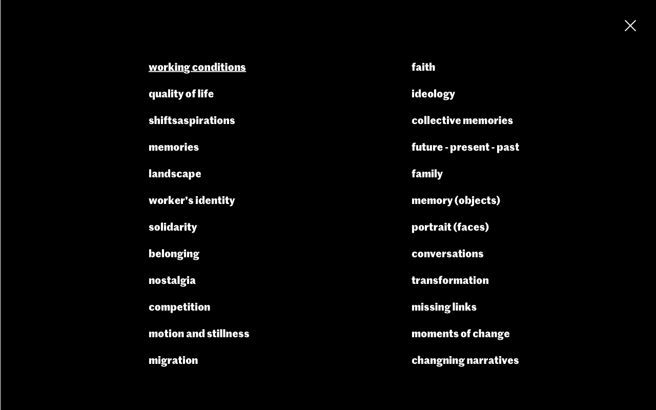
By leveraging my expertise in information architecture, user interface design, and content organization, I created an engaging and intuitive platform that allows for the seamless exploration of diverse media types and themes. I prepared information architecture that allowed me to move quickly to the interactive hi-fi prototyping stage to test user flow. I created individual page views based on insights from stakeholder interviews and visual ID rules. Then, using Marvel.app, I created an interactive prototype.

Working at User Interactions
Close collaboration with the development team is necessary, whether it's through direct consultations during implementation or by preparing necessary documentation - especially when it comes to non-static solutions related to interactions such as: behavior of the main menu (hover), cursor hover on images, and navigating.
Lesson Learned
One valuable lesson learned from this project was the importance of conducting user testing and gathering feedback throughout the design process. Iterative testing helped uncover usability issues, allowing for refinements and improvements to enhance the overall user experience. Additionally, maintaining close collaboration with the client and stakeholders ensured that the website aligned with their vision and goals, resulting in a successful outcome.