Designing an Engaging Online Guide for Exhibition
My Role : Web Designer
Timeline : 2017 / Still launched
Platform : Responsive Web Design
Methodology : User-Centered Design (UCD)

Exhibition view at Ujazdowski Castle Centre for Contemporary Art, photo by Bartosz Górka, source: ujazdowski.pl.
My Key Contributions
information architecture | high-fidelity prototyping | accounting for accessibility | conducting usability tests | interface design
Tools: Sketch, Marvel, Google Workspace, Asana
The Gotong Royong - website project / Credits & special thanks goes to: Custom Typeface - Interpunkcja font designed by Marian Misiak, Tomek Bersz; Exhibition KV designed by Krzysztof Bielecki; Client Service: Agata Kühl; Front-end developers: Daria Zychowicz, Roman Kühl; Art Direction & Final Web Design: Rubovka
Deepest thanks to the Rytm.digital, based in Warsaw (PL), for stunning collaboration throughout the creation of this website. I am honored and grateful for their trust in me to design and bring this project to life.
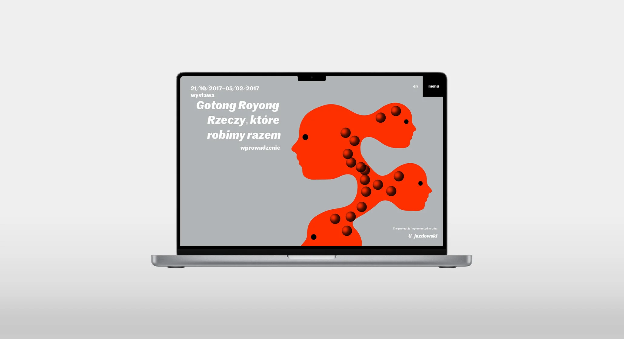
Online guide to the "Gotong Royong" exhibition, based on the new visual identification requirements.

In October 2017, the Ujazdowski Castle Centre for Contemporary Art organized an exhibition-meeting and program titled "Gotong Royong". This event aimed to showcase the spirit of collective endeavor and explore the cultural practices of informal education and social self-organization.
The exhibition provided a platform for artists and participants to engage in collaborative actions and learn from each other, fostering a sense of community and shared experience.
The client's key goal was to increase online visibility and encourage users to explore the depth and richness of the exhibition.
Collective Endeavor

Gotong Royong, in the Indonesian language, refers to a collective endeavor. It is a widely practiced method in Indonesia, which can be described as "things we do together, learning from each other through shared action." The title of the exhibition-meeting is an acknowledgment of informal education practices and social self-organization, characteristic of the local culture and known by various names in many parts of the world.
U-jazdowski has recently updated its visual identity and wanted to ensure that the experience of users accessing the online guide aligns with this fresh look.
Visual Identity Impact

The client's visual identity directly impacted the way content was laid out in the final product. The visual identity was based on typography, specifically the custom designed font, which was complemented by specially designed punctuation marks and a content organization system. Additionally, a sense of freedom was introduced, allowing for the use of various graphic forms such as photos, illustrations, or photomontages.
Enhancing Text Focus and Content Engagement
The conducted interviews revealed that the main group of users are intellectuals who need a convenient way to explore content.
The interviews confirmed the initial assumptions about the target group, but also revealed other factors affecting online guide readership, such as navigation, the ability to focus on the text and its content, and flexibility in viewing media added to the content.
Goals → Wants to to explore the content in a convenient way; to have an intuitive and easy-to-use navigation to access different sections and content within the guide; aims to focus on the text and its content without distractions, ensuring a meaningful and informative reading experience.
Pain points → Finds it challenging to navigate through the online guide if the navigation structure is unclear or confusing; get easily distracted by irrelevant or overwhelming visual elements; users with accessibility needs may encounter difficulties in accessing and navigating the online guide, resulting in a less inclusive experience.

Hi-fi prototyping
Time efficiency and cost were crucial factors, so creating full wireframes wouldn't have been as effective. However, quick creation of information architecture allowed me to move quickly to the interactive hi-fi prototyping stage to test user flow.
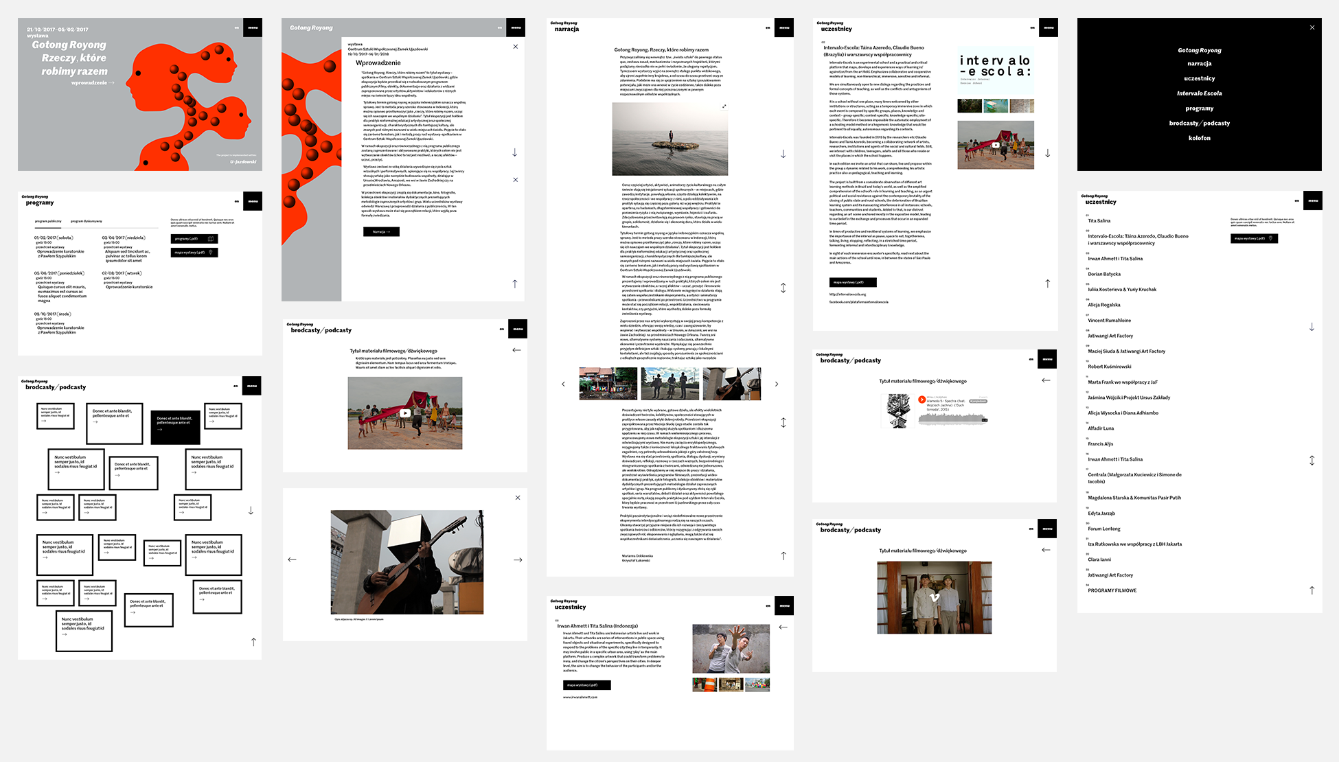
To assist the development team, I created an online magazine map and individual page views based on insights from competitive analysis, stakeholder interviews and visual ID rules. Then, using Marvel.app, I created an interactive prototype.

Focus on Text Readability & Navigation
I opted for a clean and minimalist design with a focus on text readability, which is essential for effective communication with users. Users can easily and quickly find articles and content that interests them thanks to a still visible menu and site header which is in a fixed position.
I made sure that the title of each chapter is prominently displayed on each site. I added titles associated with their corresponding content below for easy browsing. By doing so, users can quickly find and explore the content that interests them, increasing their engagement and interest in the guide.
Lesson Learned
While researching competitors' exhibition online guides, I came across many fascinating solutions, but in some instances, I found myself confused when navigating. Although creative solutions can be effective, they should not compromise ease of use.
I was really excited to try out a new and creative solution, but when I asked the user to test it, they became a bit confused and lost.
This happened when the designer prioritized visual effects over usability.
Users visit websites with a specific goal in mind, and excessive creativity can lead to confusion and frustration. Therefore, it is essential to prioritize the website's structure and ensure that navigating between articles is straightforward and intuitive.